Cactus Pear Music Festival
BRAND REFRESH & DIGITAL TRANSFORMATION
BRAND REFRESH & DIGITAL TRANSFORMATION
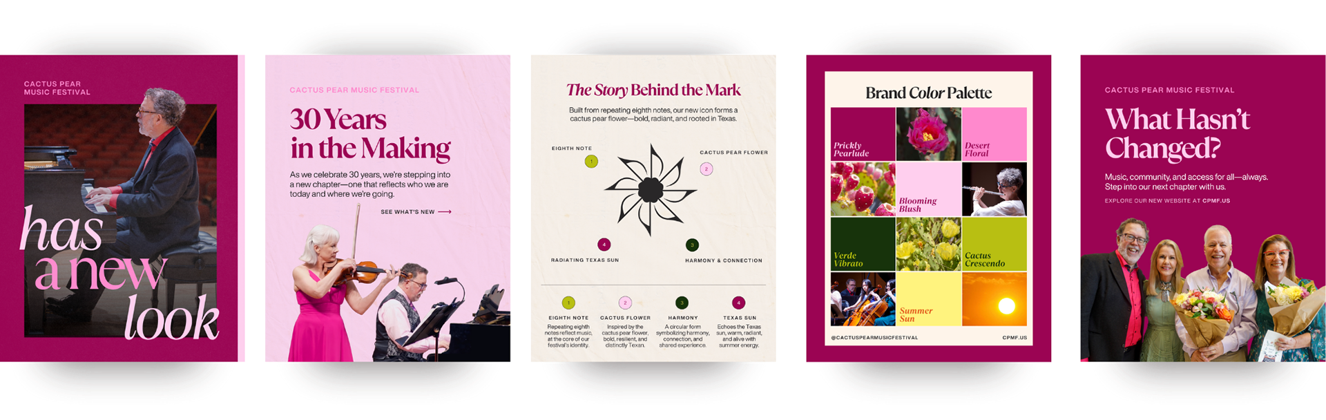
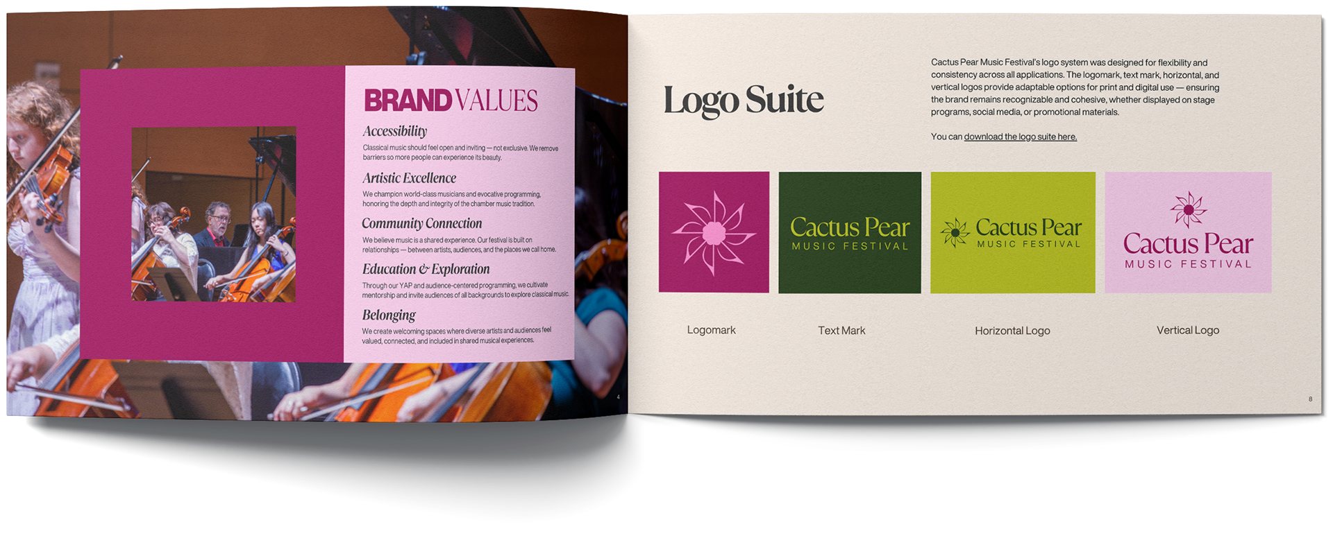
For the festival’s 30th anniversary season, I led a comprehensive brand refresh and website redesign to modernize Cactus Pear Music Festival’s digital presence while honoring its rich artistic legacy. The goal was to create a visual identity that felt timeless yet contemporary—capturing the energy, creativity, and community at the heart of the festival.
The Challenge
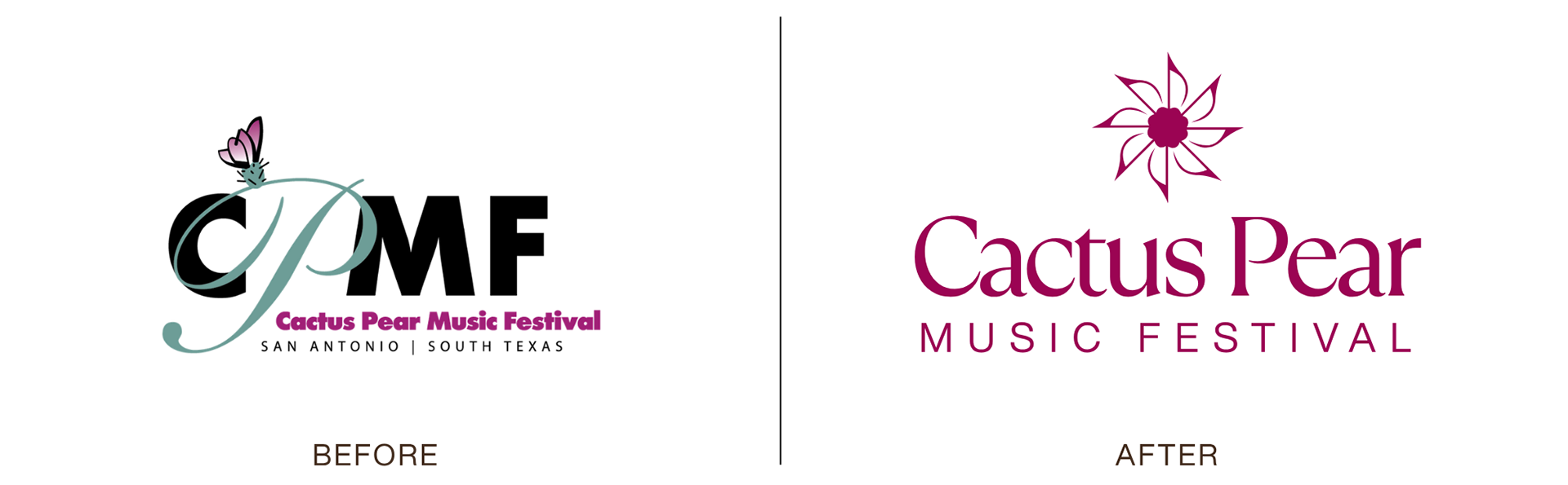
Brand Recognition & The Acronym Problem: The previous logo relied solely on an acronym, which wasn't effective because the festival didn't yet have widespread name recognition.
Brand Recognition & The Acronym Problem: The previous logo relied solely on an acronym, which wasn't effective because the festival didn't yet have widespread name recognition.
Conceptual Confusion: The old logo featured only a cactus pear illustration with no musical cues, leading audiences to misunderstand the organization's purpose.
Color Palette Inflexibility: A multi-colored palette with varying shades made the old logo difficult to adapt across different digital and print backgrounds.
The Fix
Brand Recognition & The Acronym Problem: Expanding the logo to feature the full name (Cactus Pear Music Festival).
Conceptual Confusion: Integrating the musical note element into the visual identity so the brand's core offering is immediately clear.
Color Palette Inflexibility: Condensing and streamlining the color system for cross-platform versatility.
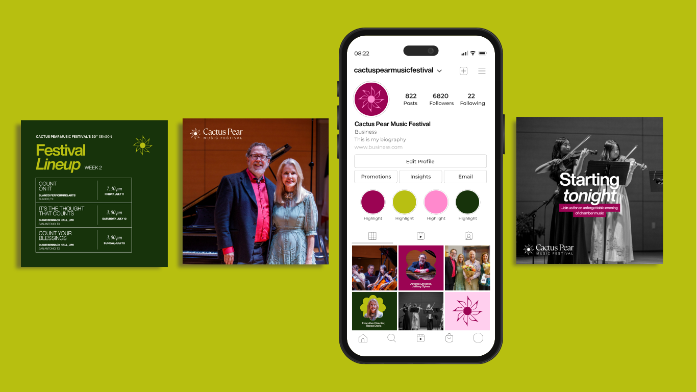
SOCIAL MEDIA
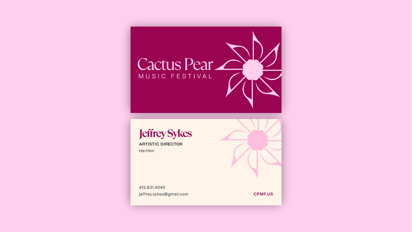
BUSINESS CARDS
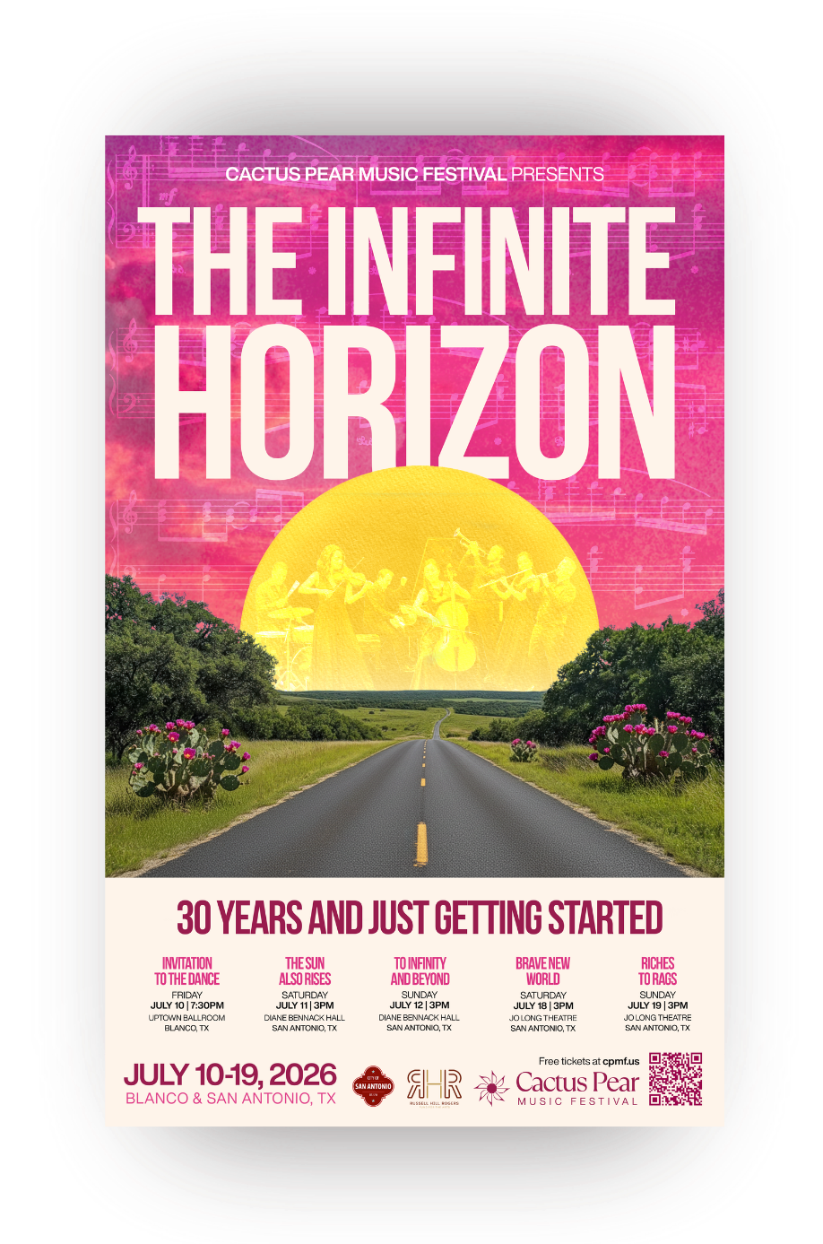
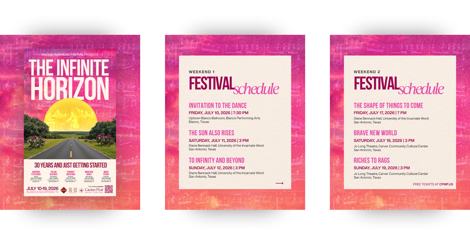
30th Anniversary Season Campaign: "The Infinite Horizon"
For the festival’s milestone 30th season, Artistic Leadership established the theme "The Infinite Horizon"—a statement signaling both the festival’s enduring legacy and its forward-looking artistic direction.
The challenge was balancing multiple conceptual layers within a single, cohesive commemorative poster:
The Horizon & Heritage: The expansive Texas landscape anchors the composition, visually grounding the festival in its roots while embodying the vast, open future of the 30-year legacy.
The Sound of the Season: To tease the festival’s expansion into ragtime—alongside the largest musician ensemble featured in years—the subtle texture of vintage ragtime sheet music is woven directly into the sky alongside a ragtime ensemble in the sun.
Milestone Scale: The visual weight and typography reflect the celebration of a 30-year journey, setting the promotional tone across digital channels, street-level collateral, and print programs.
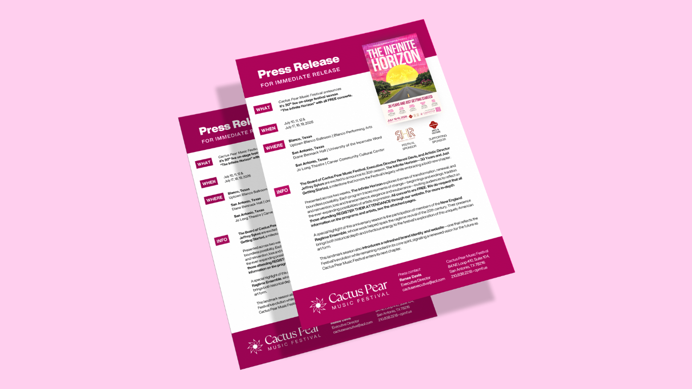
PRESS RELEASE
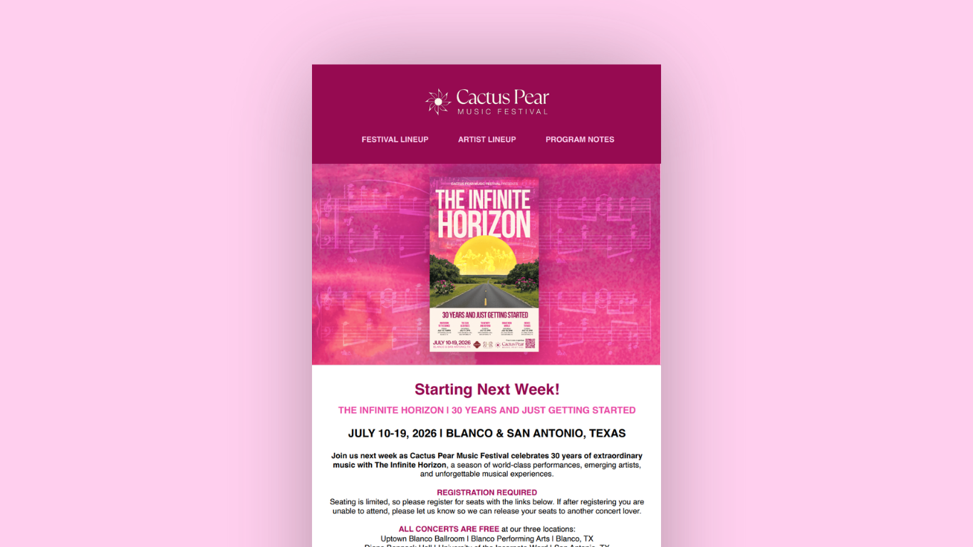
EMAIL MARKETING
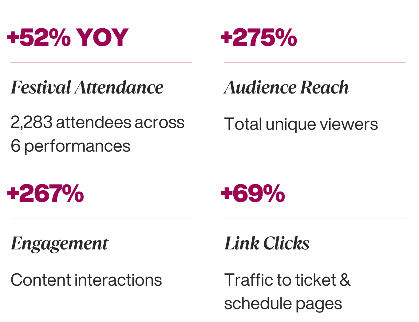
The Impact: 30th Anniversary Growth
By aligning the visual rebrand with a data-informed digital strategy across web, email, and social, the campaign drove measurable audience growth and festival attendance: