Mazette Wines
LOGO & LABEL DESIGN
LOGO & LABEL DESIGN
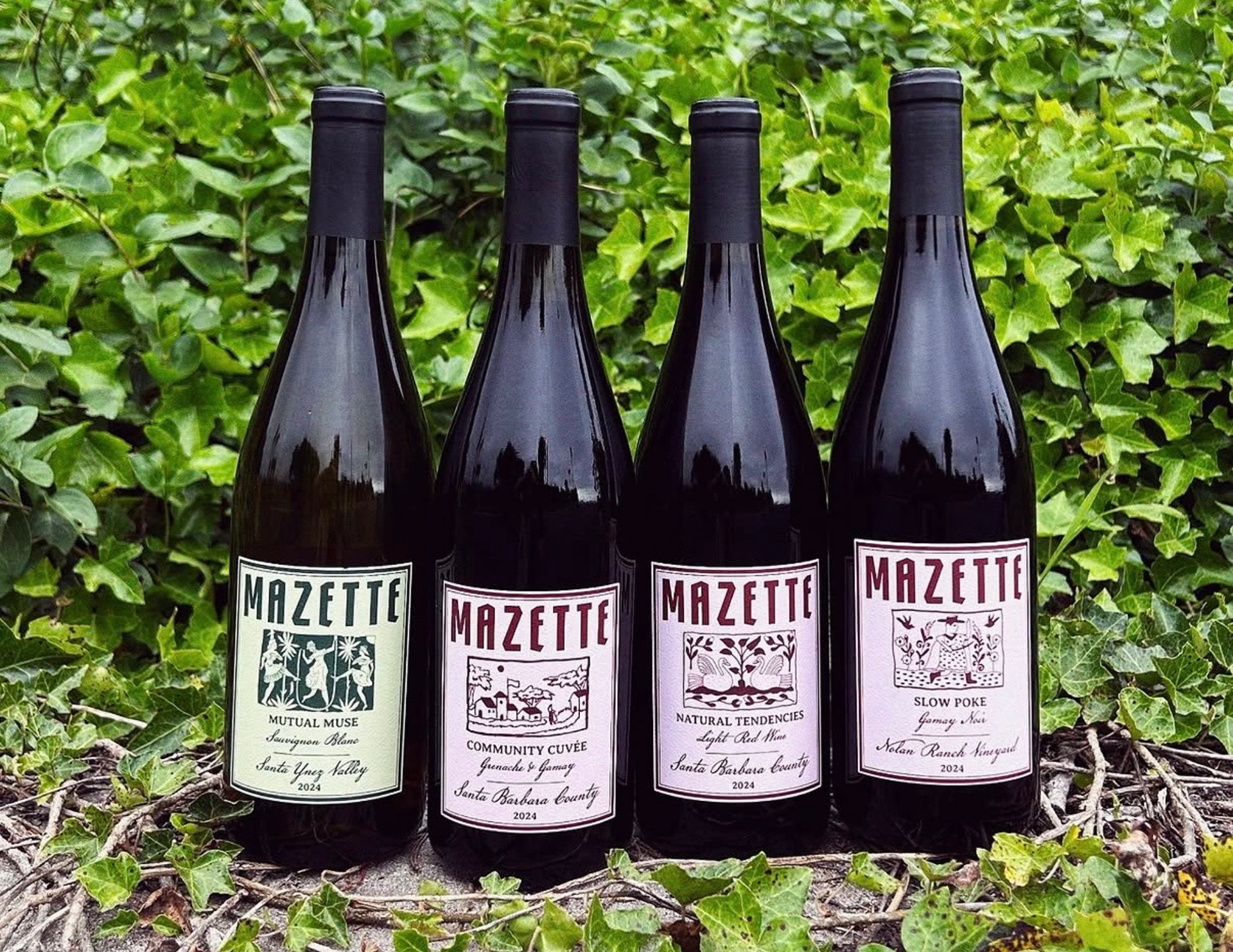
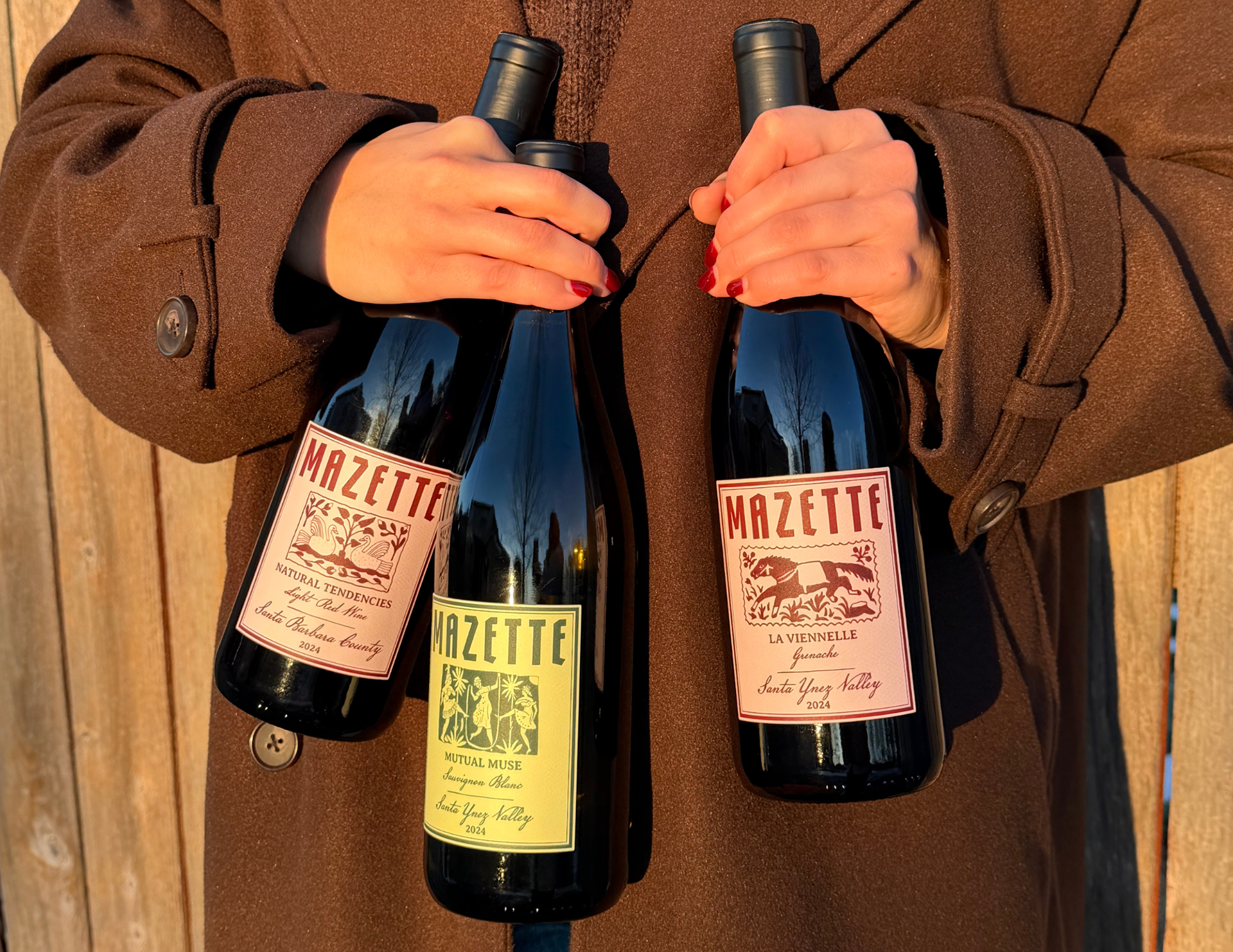
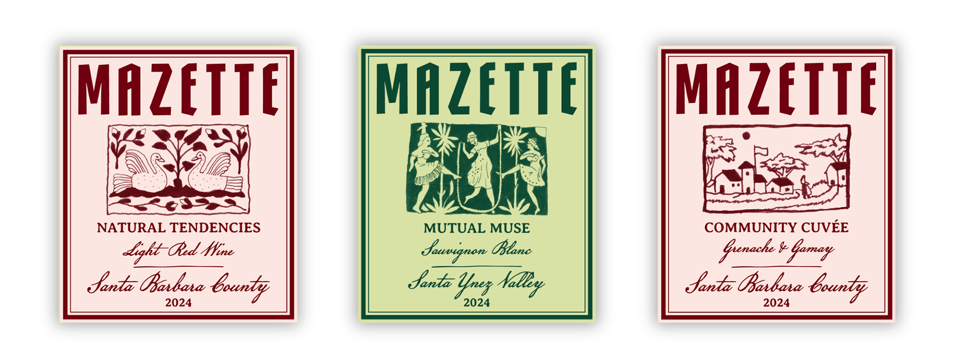
Mazette is an independent California wine label built on character, craft, and an unconventional edge. The goal was to establish a cohesive brand identity that stood out on the retail shelf while honoring the craft of natural winemaking. The identity needed to marry the gritty spirit of California tattoo culture with an earthy, approachable design made truly for the people.
Role: Brand Identity, Art Direction, Packaging & Label Design
Collaborator: Tattoo illustrations by Mr. Blue
Scope: Logo Design, Color System, Label Typography & Layout, Print Production Specifications
Impact: 100% of the debut vintage sold out

Creative Execution
Logo & Visual Identity: Developed a custom mark that captures Mazette’s modern yet rebellious ethos.
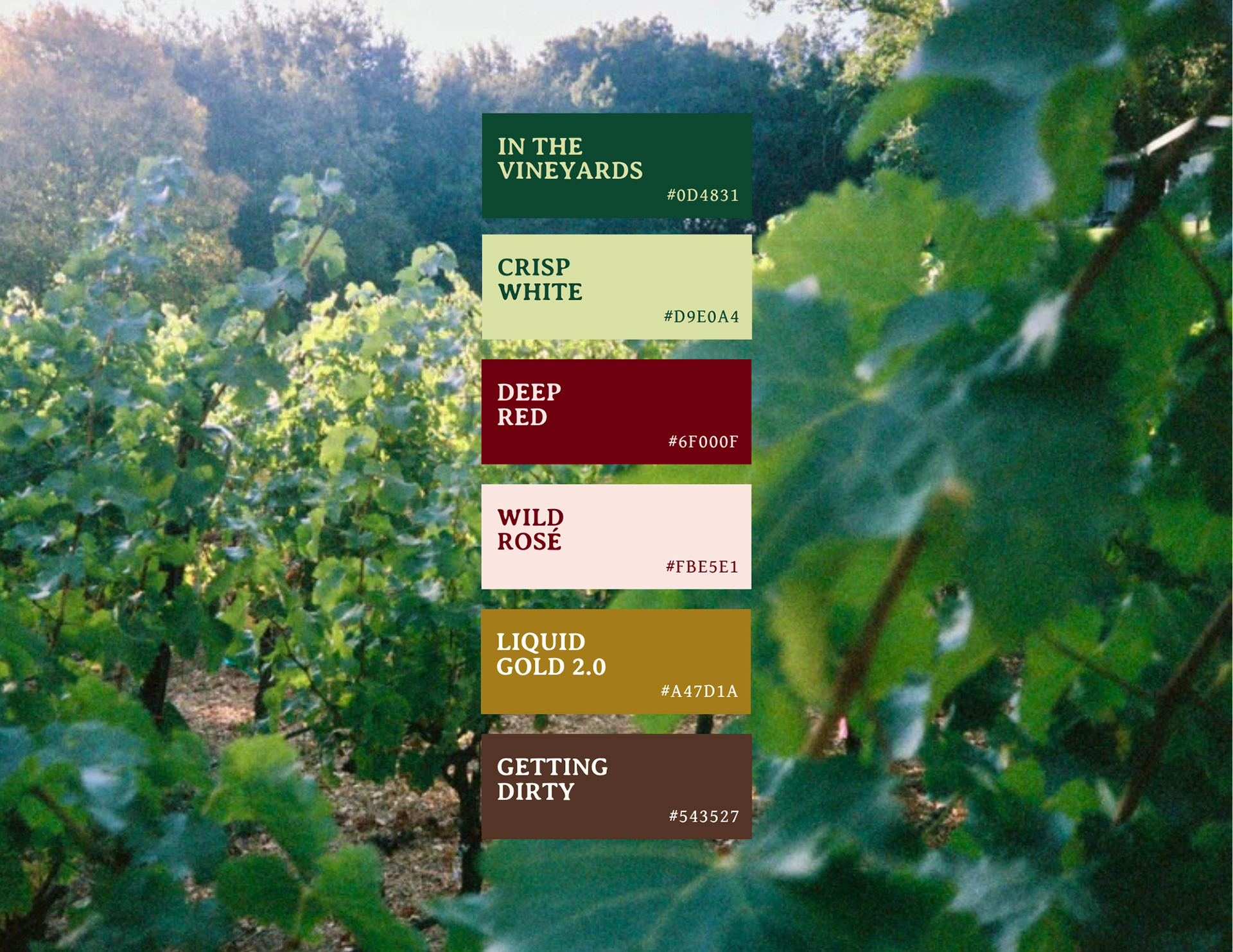
Color Palette: Built an earthy, sun-drenched California color story that complements the varietals while providing strong contrast against deep glass and paper textures.
Art Direction & Typography: Sourced and paired typographic styles that counterbalanced the hand-drawn illustration style. The layout prioritizes negative space, clear hierarchy for regulatory information, and precise structural alignment to give the label an intentional, editorial presence.
The Outcome
Mazette’s inaugural release was a success, resulting in a sold-out product line. The visual system gave the new label shelf recognition, strong word-of-mouth momentum on social platforms, and established an adaptable foundation for upcoming vintages.